
Crafting a Patient-Centered Newsletter
National African Americans with Multiple Sclerosis Registry | Content Creator
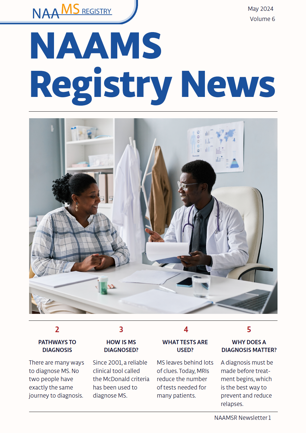
I partnered with the National African Americans with Multiple Sclerosis Registry to create a newsletter that could translate MS research and care practices into clear empowering information for patients. I led the editorial and design process from 2022 to 2025, using the CDC Clear Communication Index to craft content for a patient audience. I also used Adobe InDesign and Illustrator to design accessible layouts and visuals. This was especially important because patients with MS can have vision and cognitive symptoms that make reading more difficult.
Working closely with MS experts, I developed graphics that made complex concepts easier to understand, managed an ambitious production schedule, and built simple systems to keep our workflows organized and on schedule. This project brought together my strengths in translation, collaboration, creativity, and organization to deliver information to patients that they could genuinely use.
Collaborating with experts
Translating complex info
Creativity
CDC Clear Communication
Deadlines
Accessible design
Empathy
Adobe InDesign
Adobe Illustrator
Organization
Opportunities

Reliable workflow
How do we track deadlines, manage drafts, and keep production moving smoothly?

Visuals
How can we make difficult medical concepts easier-to-understand using visuals?

Patient-centered
Emerging medical research is written for clinicians, not patients. How can we translate complex concepts into language and visuals that support understanding and self‑advocacy?

Accessibility
How do we design a newsletter for people with vision or cognitive symptoms that make reading more difficult?

Supporting experts
How can we help busy clinicians and researchers share their insights with patients?
My Approach
Understanding the need
I began by learning what patients needed most. I read patient-facing blogs to get an idea of what was currently available and then designed content that offered something new. I learned that there is a lot of general information available to patients but not many high-quality visuals or usable tools. As a result, I made sure that every edition of our newsletter gave our readers tools they could use to self-advocate.
Patient-centered communication
To ensure consistency and clarity across issues, I implemented the CDC Clear Communication Index to guide content development. This gave the team a shared framework for writing for accessibility, structuring information, and emphasizing the most important takeaways for patients.
Designing for accessibility
I built accessible layouts and visuals in Adobe InDesign and Illustrator. I used best practices to design typography, contrast, hierarchy, and visuals. When concepts were too complex for text alone, I created simple graphics to make them easier to understand.
Strengthening collaboration
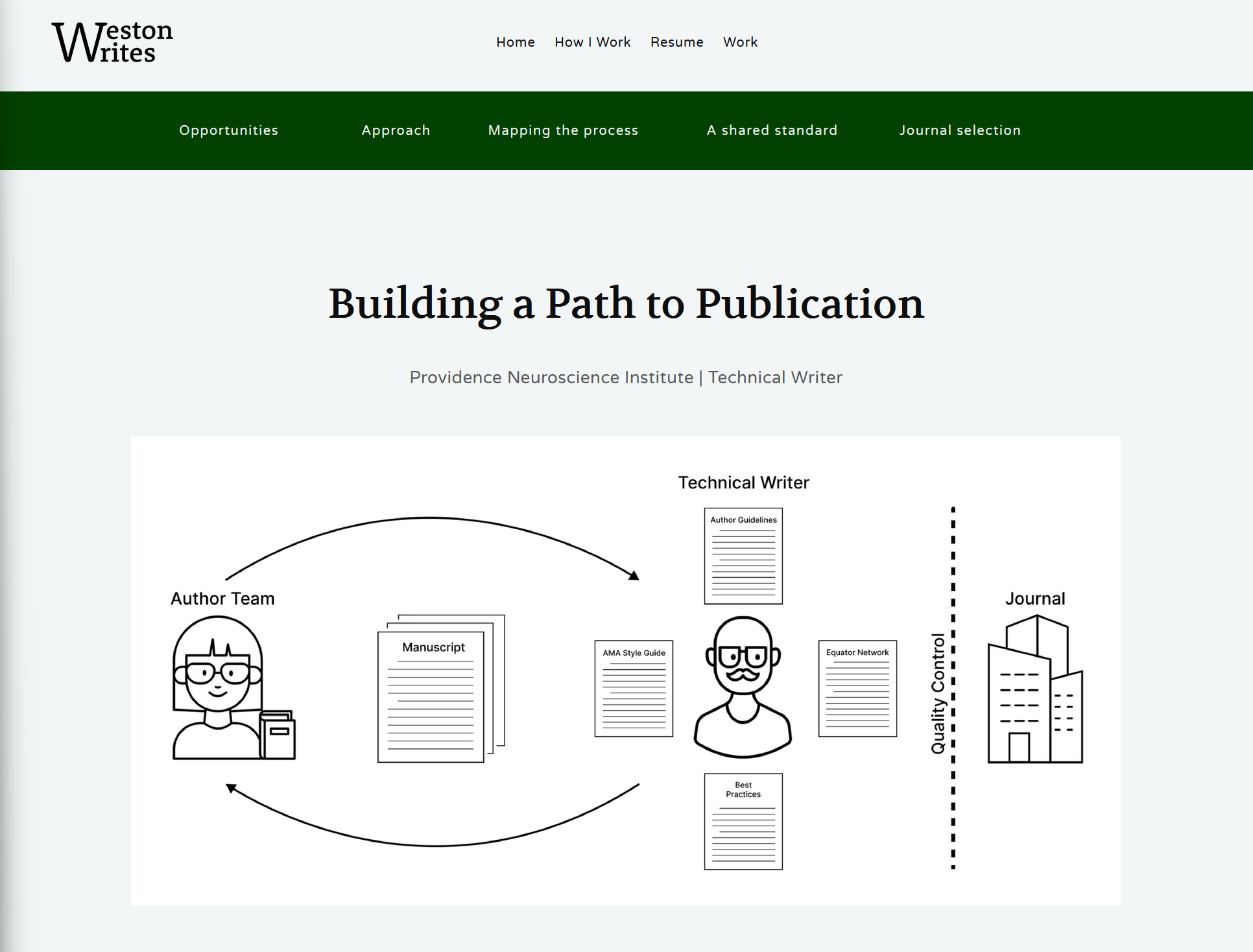
I worked closely with busy experts to translate their knowledge into patient‑friendly messages. By asking precise questions and offering kind, direct feedback, I helped experts share insights efficiently despite limited time.
Building a sustainable workflow
To keep our publishing schedule on track, I created a lightweight content management tool that organized deadlines, content topics, and team-member roles in one place. This made the process predictable, transparent, and easy for a small team to maintain.
Patient-centered, accessible design
The Clear Communication Index guided how I structured the content of the newsletter. Following best practices outlined by the CDC, I placed the main message up top, added visual aids, limited the use of technical terms, and included a glossary to support readers when technical terms were unavoidable.
I also used a topic-based authoring approach, where each page of the newsletter covers a single topic. This, combined with the strong use of information hierarchy, enabled readers to skim each newsletter to look for the topics most relevant to their needs.
Typography and color
The W3C guidelines informed my typography and color choices. I selected text and background color combinations that met the highest AA/AAA accessibility standards for contrast and readable type. The typeface, hierarchy and line spacing were designed to support patients with vision or cognitive symptoms and the use of screen readers. Together, these choices created a clear, accessible reading experience that made complex MS information easier to understand.
Keeping the newsletter on track
I built a simple content tracker to keep our publishing schedule predictable and transparent. It organized topics, deadlines, authors, and review stages in one place, giving our small team a clear view of what was published, what was in progress, and what needed attention next. This lightweight system made it easier for busy clinicians and contributors to stay aligned and helped us maintain a consistent cadence for our nationwide patient audience.
Visualizing complex ideas
I used visual communication to make complex MS concepts easier for patients to understand. When text alone wasn’t enough, I created comparison tables, diagrams, and simple illustrations that clarified how therapies work and what patients could expect from different treatment options. These visuals reduced cognitive load, supported readers with varying levels of health literacy, and turned abstract ideas into concrete, approachable information. These visualizations became an essential part of how the newsletter delivered information to readers with clarity.
Impact and outcomes
More accessible information
The newsletter translated complex MS care practices into plain‑language content that patients could understand and use. Visual aids, glossaries, and structured messaging improved clarity for readers with diverse health literacy and accessibility needs.
A consistent cadence
The content tracker streamlined workflow and kept our team aligned on deadlines. Even with limited clinician availability, the team maintained a steady publishing rhythm for a nationwide audience.
Stronger collaboration
By offering kind, direct editorial support, I helped clinicians share insights with patients more efficiently. This strengthened trust, reduced revision cycles, and made the process easier for busy contributors.
Design that supported understanding
Accessible typography, high‑contrast color choices, and simple visuals made complex medical concepts easier to grasp. These design choices reduced cognitive load and improved the overall reading experience.
Next case
Building a path to publication at Providence Neuroscience Institute.